When we bought this house, we did what most people do. We walked around, mentally mapping out rooms; this one a bedroom, that the office, here a playroom, there the kitchen. We joked about buying a four bedroom home when there were only two of us; plenty of space for our family to grow and still leave us with room to have all of the extras we wanted.
Over time, we’ve taken that seemingly huge home and filled it. Literally. Those four bedrooms house us in one, a nursery and our son’s room. Leaving us with one room left. The small one. The awkward shaped one. The one we need to function as both a spare room and an office.
Our big challenge has been how to maximise the space in a small bedroom given that previously it housed only a double bed and did a fine impression of being wall-to-wall mattress. How to fit a double bed in and a computer desk? And how to make both of those accessible without expecting people to have to leapfrog various bits of furniture!? Whilst still giving us storage space for the piles of belongings we seem to accumulate. Oh, and we wanted it to be welcoming. Easy, right? Here’s how we did it…
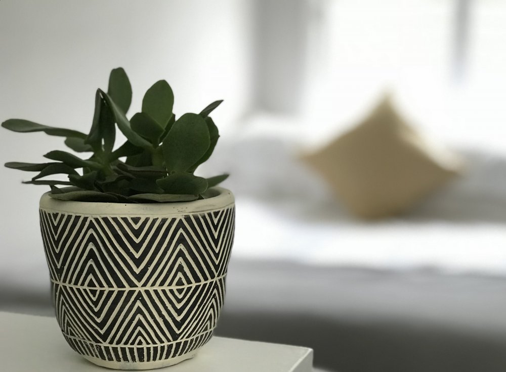
Maximise Natural Light
As it’s a north-facing bedroom, it’s important to maximise the natural light in order to keep it feeling bright and spacious despite being of limited size and not getting any direct sunlight. This room is over the stairs so loses a considerable chunk of the room to the stairwell bulkhead. We talked about building cupboard storage over this in order to hide it and utilise effectively dead space. However, the door opens the other way and this would have meant walking straight into a large cupboard, making the room feel dark. Instead, we’ve opted to keep that stairwell bulkhead open, keeping the maximum light coming through the room so that it feels as spacious as possible as you enter.
Similarly, we’ve opted for the tried and tested method of using a mirror to reflect back as much light as possible. Not only will a mirror help to brighten the room, but it also creates an illusion of additional space in the room. For example, placing it opposite the door makes the room appear longer as you enter! Given that our room is fairly narrow, we’ve placed a mirror on one of the side walls to give the room a feel of greater width.
Clever Storage
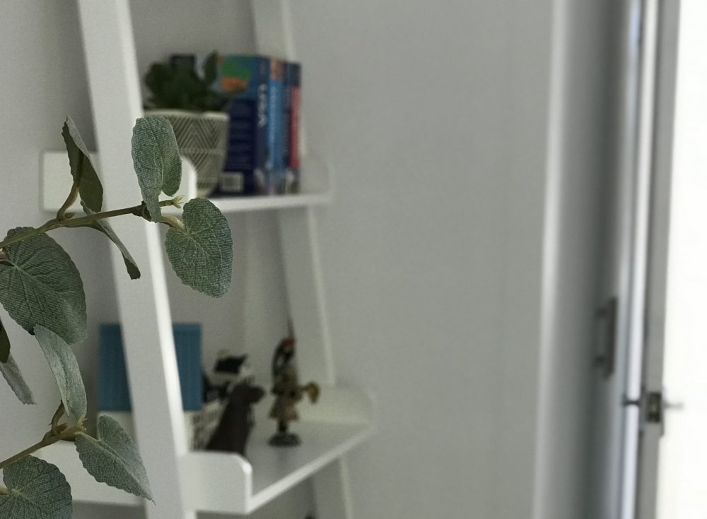
In a small room you want to maintain storage without making it look cluttered. For us, this meant finding ways to hide the piles of ‘bits’ that a spare room can accumulate… winter coats, paperwork, suitcases, you know the drill. Firstly, we decided to keep the cupboard in it’s current position, tucked behind the door. This means that upon entering the room, the main storage isn’t visible. Our doorway is set off of the wall and would otherwise create a dead space behind it. Instead, by placing a floor to ceiling inbuilt cupboard there, we’ve been able to utilise the space without it being overly obvious.
For additional storage, we opted for a divan mattress base with inbuilt storage. Rather than drawers (we’d be unable to open them as there’s insufficient room!), we opted for a lift up base and I’m genuinely impressed. It’s not something I’d want to access on a daily basis as it does mean the bed needs a tidy afterward but it’s perfect for storing items that you don’t need very often. It’s hidden storage that’s far tidier and more practical than sliding things under the bed and allows us to effectively double the usability of the ‘bed’ space!
Play With Dimensions
As it’s a spare room, we knew that we needed to be able to offer a bed that a couple could sleep in comfortably. However, after assessing our double bed, we knew that it would mean a very tight squeeze, resulting in guests having to leap onto the bed from afar! Hardly practical! Instead, we opted for a 3/4 sized mattress, otherwise known as a small double. By putting that in, we’ve created a small amount of space between the bed and the desk, allowing both to be accessed comfortably. Additionally it looks like a double thus tricking your eyes into thinking the room is bigger. We opted for a Simba Hybrid mattress, which comes in a small box and ‘inflates’ upon opening, thus allowing us to get it around the narrow stairwell and into the room.
When playing with dimensions, it’s important to not sacrifice on quality. After all, why bother having a bed if it doesn’t sleep your guests (or snoring partner!) in comfort? With 35,000 five star reviews, we felt confident that the Simba Hybrid Mattress’s combination of pocket springs and memory foam would give any guest of ours a good night’s sleep. Having tested it out myself, I can categorically say, they won’t even notice that the bed is slightly narrower than a normal double!
Use Clean Lines
When you’re trying to create space, you want clean lines and a lack of clutter. We opted for wooden shutters instead of curtains in this room for two main reasons; firstly, there’s no requirement for space either side or below the window. Shutters don’t need the room that curtains do, once fitted you generally don’t even need to be able to open them on a daily basis, just tilt the shutter slats to suit your requirements for light! I recommend shutters with a hidden tilt bar (rather than having a central line down each shutter), again allowing you to keep the aesthetics as clean and simple as possible as well as allowing that little bit extra light in!
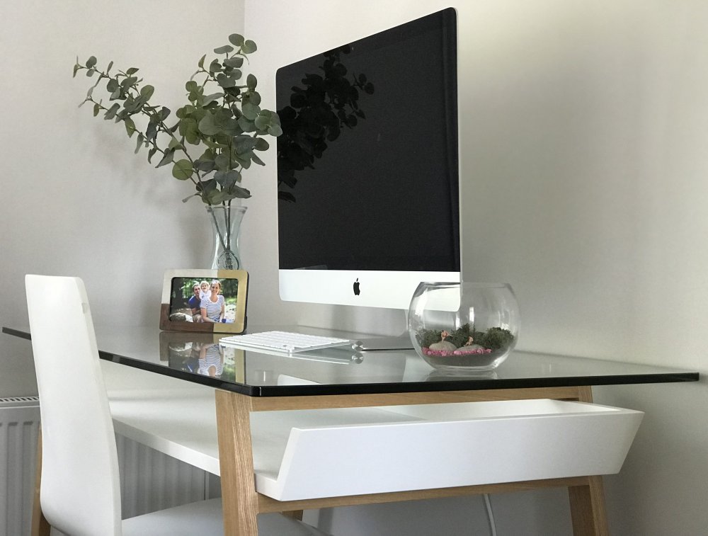
In terms of furniture, floating or glass elements will retain that roomy illusion. We’ve opted for a minimalist glass topped desk and a ladder shelf. Both give us the required functionality without looking bulky against the walls. Floating shelves would have a similar effect, just be sure that your walls and the fixings are strong enough to hold your intended load!
Don’t Be Afraid Of Colour
It’s well known that light walls can make a room seem larger but don’t be afraid of adding colour to your room! A lighter ceiling can make the room appear taller than it actually is (it doesn’t have to always be white!) and paired with a dark colour on the walls and lighter furniture, you can still have a room that looks spacious and inviting. Just be sure to keep furniture and accessories to a minimum to avoid it looking cluttered at the same time! That said, we’ve opted for light walls in our space. With small children we wanted to put in a darker carpet to reduce the visibility of any marks and stains. This, combined with the room being north facing, meant lighter walls better suit our needs. Instead, we’ll be adding colour pops in the soft furnishings and in prints on the walls… when we finally get those done!
You can read a full review of our Simba Hybrid Mattress by clicking here.




No Comments